3.31.2008
Embellishments has a New Website!
Sandy Hook, New Jersey

 I just had to post this darling map I did last summer for a bride getting married at the light house at Sandy Hook, New Jersey. The map is written in the casual freehand script and is colored so beautifully that I had extras printed for myself to keep on hand as samples. I love this map. Over Christmas break we visited New Jersey and since I'd done the map I insisted we drive up to this gorgeous stretch of land between the Atlantic and mainland New Jersey. It is quite an interesting place for a wedding. It is the home of the oldest working lighthouse in the US but also to a military armory and barracks. It is surrounded on three sides by water and you can see New York off in the distance, it's long grass and sand dunes at sunset make for gorgeous photos and picturesque memories. As you can see we had a great time, though it was cold in December!
{What a gorgeous sunset}
{Oh George, when are you not goofing around?}
{Here I am with NYC sparkling in the distance}
3.28.2008
Real Weddings: The Four Seasons Maui

I wanted to share these gorgeous photos courtesy of Lucky Paperie in Atlanta of a three color letterpress invitation and all its perfect paper accessories for a lovely wedding that took place last year in Maui. The invitations were printed individually on hand-made paper from Porridge Paper and utilize three custom ink colors. They were placed in tissue and tied with a Midori double-faced satin ribbon with a sea shell in each. I then hand-calligraphed the boxes in my Camden script style to match the style writing on the invitation.

Here's a great close up of the beautiful shell image on each invitation.

Gorgeous bridesmaids dresses even tied into the color scheme.

Many couples who have destination weddings choose to give out an itinerary to each of their guests with ideas for local activities and the wedding schedule events. These are perfect for welcome baskets or are often sent out in advance, sometimes with the invitation. How cute is this one with all the tropical designs on the left side?

Here's a great picture of the table settings, which of course included beautifully letterpressed menus, backed with coordinating brown paper. Simply gorgeous!

3.27.2008
Beautiful Birthday Invitations
 Jenny down at Z Paperie just sent me the cutest images of her "29th Birthday" Invitations. The writing was all done by hand, and then I sent it over to her and she has incorporated it into these adorable invitations with an orange border and a citrus colored pattern around that. Wouldn't the envelopes look great with a matching liner? With invitations like these you know it is going to be a great party!
3.25.2008
Calligraphy in Rosen Script
3.24.2008
Arlington Map
 For all you map junkies out there I have more and more maps for your viewing pleasure. This just completed today is a lovely map of the Arlington area, just West of Washington, DC. The 5x7 map details eactly how to get from the ceremony/reception site to the after party site. With such adorable maps, I can't see how anyone would get lost along the way. Stay tuned for more maps. This is just one of many I completed this week.
Joleen also has an insert card, to instruct the guests on how to make it to the Welcome Dinner. It compliments the map perfectly but will be printed on a separate piece of paper, which is smaller, only 4x6.
3.23.2008
Happy Easter Everyone
3.22.2008
Letterpress Invitations
I just picked up this custom Save the Date/Map set from the Letterpress yesterday and I am so excited with how lovely they turned out. The set is written in Elegance script and is a double- sided Save the Date with a map of Santa Barbara on the reverse. It's printed on 300 lb. watercolor paper and includes a matching accomodations card. The envelopes are aqua colored and match the ink perfectly. What a wonderful prelude to the invitation!
3.21.2008
Another Cute Cake Sign
 Today I was not in an envelope mood. I was more in a painting type of mood. As you can see by these two most recent posts, I spent the day working on things with paint. First the map, now this adorable cake sign for lovely Jill Rose in Brooklyn, New York. It's perfect because she sent a picture of her cake and I did this nice little rendering for her. Its about 8" in diameter on ivory scalloped paper and has pink ink in the ever-popular elegance script. The cake is mounted on the ivory so it actually stands out a bit from the rest. I painted it with a mixture of watercolor and gouache. These little guys are completely custom, so if you want one they can be purchased on my etsy page and painted or drawn however you prefer. And, I just found out today that I'll be doing Jill's calligraphy for her envelope addressing too, in the matching elegance script! I can't wait...
3.20.2008
A Little More Map Inspiration


 Here's the bottom left corner
Top left corner...

3.19.2008
Another Thanks To....
Etsy's Handmade Wedding Series

More exciting news! We've been featured again on the Handmade Wedding Series over on wonderful Etsy. The article, by Jan of the Poppytalk blog, is all about classic invitations and paper goods from artisans on Etsy, and she chose three of my designs!
 This scan of an invitation I did in the Cherise style was the first item in her review!
Also making the cut was the map I drew last fall for Stephanie Cline in Atlanta, Georgia. It is hand-painted and then printed on an offset printer. The calligraphy style is Copperplate. And finally, my favorite photo of the sanddollars are there as well. Perfect for a beach wedding, individually painted with care. A perfect replacement for the standard paper placecard. Table names are written at the bottom of the shell.
Thank you so much to Jan at Poppytalk and Etsy for featuring me today! I am so honored to be up on your site for all the Etsy-ians to look at!
3.18.2008
Invitations for a Summer Beach Wedding
3.17.2008
Copperplate Script
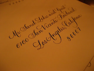
Here are some great photos of some recent work I did in Copperplate Script. The client just emailed me the list and sent envelopes pre-stuffed and then I addressed them and just popped them in the mail! I think they came out great. The invitation was a combination of pewter grey and kelly green and look how decorative the envelopes are. Adorable and perfect for St. Patty's Day.
3.15.2008
Etsy Handmade Wedding
Thanks so much onesmallstar for putting up the pictures. The main envelope is Cezanne Script. It seems to be very popular right now!
Maps Maps Maps!!
 Oh how I love to create maps! They are so much fun. I adore drawing maps for new places, such as this one in Lake Placid, NY. It incorporates the wedding locations and locale eateries, the golf course, and fishing hot spots. It's being printed as a Z fold itinerary with a Save the Date on another side of the paper. As soon as I get a couple back I'll put up a new photo. The map was colored beautifully by my friend Jenny at Z Paperie.
I also created this map for Z Paperie which Jenny has also featured on her new blog! She has colored it very whimsically with a fading background and lots of different colors. It shows the location of her invitation studio and it is really quite lovely.
3.14.2008
Real Weddings: Another Hawaiian Event

Colby approached me over a year ago to create the beautiful invitation for her wedding in beautiful Honolulu, Hawaii. I was very excited to take part in her DIY invitation adventure. She had the calligraphy artwork letterpress by Jill Nieporte of Jill Cate and then she assembled all the pieces herself. The invitation was quite large, and it was pressed on a very fine handmade paper in a copper ink. Each invitation had a watermark of her initial in the Hawaiian Quilt. It was truly so unique and beautiful. The paper was then layered over a thicker handmade paper and rolled into a scroll. The components were all placed in a tube with a label I addressed in copper metallic ink to each guest. It was truly a challenge to find an ink that would write on these fibrous handmade paper labels Colby printed and tore herself. Instead of an inner envelope, she incorporated a paper band with each guest's name and tied with a copper ribbon, sealed with wax. Here is the set laid out. She even created these gorgeous programs, hand-covered in bamboo paper. Each program incorporated custom artwork I wrote out as she specified. She did all the design work herself! When I asked how she found the time, she replied that she did a lot of the work while she and her fiance watched TV.
 Colby also had a custom map drawn. All the writing she chose was my citadel script.
  Here is a zoom in of her map. I used the quilt initial as the compass! Because the church was quite a distance from the reception site I incorporated an inset at the top right corner to show directions on how to get there.
 Each program had pictures of her family members who had also been married at the same church in Honolulu. The pages each had calligraphed titles printed with the quilt watermark on each edge.
Each place setting was marked with a large envelope place card with a name on each. The place cards were of course assembled by Colby with paper from Paper Source. Colby was one of those brides I had the privilege of working close with over a long period of time. I am always sad when the wedding comes and I know our working relationship is over, however I get excited to see the pictures!


