


9.19.2011
Adventures of a Bride to Be
June 21, 2011
 My venue mailing to be put into the hands of the USPS tomorrow, I am moving along on my list of items to cross off…while, of course, adding others.
 Advice to be heeded if you can: STOP LOOKING AT WEDDING WEBSITES AND MAGAZINES a month before your wedding or you will decide to buy/do/create things that, really, you could have been just fine without.
I didn’t heed my own advice.
Our wedding day was predicted to be hot, and would also be outdoors, so we decided to have little bottles of Coke, Diet Coke, and Sprite in tubs for our guests to drink when they arrived for the ceremony. I saw the striped straws in some magazine, and not being able to find them anywhere, one of my favorite websites of all tiem…Etsy.com…came to the rescue.
Pink striped straws in hand, now I had to create the cute little flags that everyone sees on them, attach them to the straws, and find a cute display cup for them as well.
Easier said than done.
One of many items left on my ToDo list, I still was without dresses for my daughters, so I had to follow-up with the manufacturer as to their whereabouts. We are now about a month out & I needed those dresses in case they needed alterations locally. After contacting them, I was told they’d be shipping before the July 4 holiday in plenty of time for alterations, if needed.
Last-minute items were coming from Laura, beautiful though they were, that also meant more work: menus, programs, table signs.
I swear, I LOVE my wedding design, I love my dress, I love the colors, I love my fiance… I was not loving the final days of details I no longer felt like keeping up with. I needed a second wind and one was not to be found, though I had to finish things up, so I had no choice. I was not bridezilla, I was bridexhausted. One month, one day & counting…
Until next time,
“There is a great deal of satisfaction to be found
in the complete exhaustion left behind by a job well done.”
~Unknown
xoxo,
Alycia
9.17.2011
Sneak Peek: New LHC Website & Blog!
While it has been quite a busy wedding season, we've also been working behind the scenes developing a brand new look for the Laura Hooper Calligraphy website and A Lucky Orchid Wedding blog! On our new site you will find more invitation suites, more maps, more event signage and more information on all the the Laura Hooper Calligraphy specialties!
The site will be ready to launch as early as next week, but in the mean time, here's a sneak peak of the new home page...

We hope you will visit the site once we launch and take a look around at all we have to offer at Laura Hooper Calligraphy!
9.16.2011
Invitations: Summer Starfish
The crisp air of fall is sneaking up on us more and more each morning and night, but the nice 70 degree mid-days remind us that there are still a few remaining days of summer. So what better time than to share a sweet starfish monogram invitation suite with accompanying program and menu!

The couple used the luxurious letter press print method for the invitation piece and RSVP card giving the summer set a more elegant feeling.

The wedding took place in Hawaii, so the couple utilized the RSVP to get a bit of information from their guests.

They not only tactfully let their guests know which parts of the weekend were appropriate for children and which were not, but they also obtained arrival and accommodation information ~ and of course we think the delicate icons are a charming touch!
The monogram continued to the reception with a tie-top program and menu card.


Here's a close-up of the adorable starfish with the couple's initials.

9.15.2011
Maps: France
We created the below map of France as a save the date card for a couple getting married in France next June 2012.

The bride was so sweet and provided some information to help us "envision" the map. From the bride:
The wedding will be in the south France, with the two ceremonies (cival and religious) being in my fiances home town of Ollioules and the reception on a near by island, Ile de Bendor, just off the coast of Bandol. The theme of the wedding is classic with a touch of Provence - lavender, olive trees etc.
She even included a photo of the church to help with our rendition:

We make so many maps each week it is such a joy to get a little background on the couple and location!
9.14.2011
In the Press: BRIDES Magazine September 2011
Back in February we shared a romantic wedding that took place amongst the beautiful, outdoor setting of the LongHouse Reserve in East Hampton, New York, and it is currently featured in the September issue of BRIDES magazine! With impeccable design by Beth Helmstetter and delectable photos by Corbin Gurkin, this piece is definite eye-candy!


We were pleased to contribute the stationery for both the wedding and rehearsal clam bake as well as escort cards, table cards and menus!


Everything was very classic which made for a tasteful, clean look while also maintaining an overall elegance. Tres chic!
9.13.2011
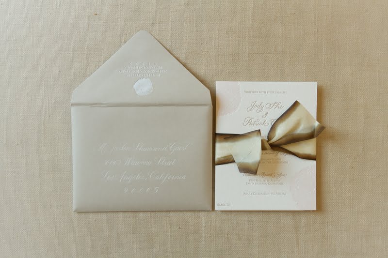
Creative Tip: Pocket Folders
Last week we showed you belly bands and ribbon to keep your invitation suite together, but another option is to hold it all together in a unique pocket folder designed to match your suite!


All bundled neatly together in a pocket folder...

You'll notice that the main invitation is adhered to the right side and the accompanying pieces are bound together and tucked neatly inside the pocket fold! Another special touch included in this suite is that the envelope is also printed with the design!

It's added touches like these that will enhance your invitation suite, set the tone for the wedding and make a lasting first impression with all of your guests!
9.12.2011
Adventures of a Bride-to-Be
June 7, 2011

Yes, another mailing.
My wedding is going to be at a venue that you have to find the location for the ceremony & reception, so I neeed to send maps to help them get to where they needed to be. Whereas maps were printed by the Chicago Botanic Garden for visitors, they wouldn’t be easily used by wedding guests trying to find a ceremony & reception.
Fortunately, I knew someone who did these amazing maps by hand & would recreate a much smaller, more weddingish version of the information I needed my guests to know.
OH, LAURA?!?!?!
I did think ahead on this one, so they were ready to go, I just needed to wait for RSVPs to come in so that I would send them to those guests that were attending. My goal is to send them all out one month in advance of the wedding, and then any stragglers thereafter, to guests & any vendors that should know where they needed to go.
I sweat the details. It is my nature.
Even though our wedding day is almost here (and I have SO SO SO much left to do!), my attention to each detail solely to make my guests feel welcome, so welcome they shall feel…

INGREDIENTS:
DOUBLE-SIDED MAP & QUOTE WRAP CLOSURE: Laura Hooper Calligraphy
FLORAL PAPERS: Paper Mojo
CLEAR VELLUM ENVELOPES: Paper and More
STAMPS: Zazzle
Until next time,
“It's the little details that are vital. Little things make big things happen.”
~John Wooden
xoxo,
Alycia
9.09.2011
In the Press: INSIDE Weddings Fall 2011
Last week we shared my own bridal shower featured in the new Fall issue of INSIDE Weddings, and we are so pleased that another one of our clients' weddings was also included in the issue! They worked wth the lovely Susan & Kathy of Bella Weddings to create a culturally vibrant celebration that all began when the groom flew all the way to Sri Lanka to ask for the bride's parents permission! And with MiBelle Photography behind the camera - the photos are sure to be treasured by the happy couple and their families!


We were able to create the rehearsal dinner invitation and also pen the escort cards on our ever popular compasses!


Read more on this wedding on the Mi Belle blog or read about the groom's trip to Sri Lanka on the INSIDE Weddings blog!
9.08.2011
Creative Tip: Seating Charts
Last week we showed you a variety of charming seating charts, and today we wanted to feature a nautical themed one for a wedding taking place on Santa Cruz Island.

Each flag icon represents a nautical boating flag and each couple's name is written on the tiny boats clustered around the flags in "coves" on the island!
The bride & groom also ordered table cards so the guests could find their seats. Below is just a sampling.


The nautical themed chart is a unique way to incorporate the couple's love of boating into their big day!
9.06.2011
Creative Tip: Belly Bands
Sometimes clients want to add a final touch to their invitation suite and including a belly band is a great way to create the finished look! The adorable envelope liner helps too!


The all-script invitation suite exudes elegance and the gold band completes the set. You can also create the belly band look with ribbon!

These extra pieces help to make your set truly unique and showcase your wedding style.
9.05.2011
Invitation Suite: Red, White & Blue
As we observe the Labor Day holiday, which marks the "unofficial end of summer" {technically the last day isn't until September 22!}, we thought it would be fun to share this simple invite set fashioned in the traditional colors of red, white & blue!


9.02.2011
Creative Tip: Seating Charts
One of our increasingly popular items has been seating charts ~ they are perfect for engagement parties, rehearsal dinners and are being used more and more in wedding themselves. Both stylish and functional, our hand-illustrated charts can be created to match your invitation suite, or be themed to display a shared interest of the bride and groom!


Seating charts most commonly display the layout of the venue with guests listed alphabetically by table, or we can customize your chart however you wish.
You can also see our charts featured on Martha Stewart Weddings online!
9.01.2011
Maps: Santa Barbara, CA
We often showcase our vibrant, colorful maps, but there is something equally as charming with this single-color map of the coastal town of Santa Barbara.

Of course the sweet red trolley car can't go without mention! We also captured the buildings out on the pier. The delicate touches make this simple map...simply perfect!
Subscribe to:
Posts (Atom)